The long awaited day finally came when I could go to Anstey wallpaper factory to colour proof my new Wild Edge design. I finished my design back in July but it takes about eight weeks for the printing cylinders to be created and delivered to the factory so I've had to be patient!

It's always amazing to see the cylinders for the first time. This print method is called gravure where the designs are finely etched into a metal cylinder. It can offer a lot of tonal variety per colour which suits my work really well.

This is the first design I have made with three cylinders and I have found it challenging to have SO many colour possibilities to work with. It's been a steep learning curve.

So while I have been waiting I have been trying to figure out what works and where I wanted to go with it. The factory invite you onsite to work with one of their marvelous colourists for the day but before you go, they ask you to send over some ideas digitally, so they have a place to start.

When we arrived in our little room on Wednesday morning in our hi-vis visitors jackets we had some test prints waiting for us.

Our colourist was called Rupe and he was amazing. You can show him a colour, or even just try and describe a colour and he will mix it by eye and hand.

I took Dean with me because, being a painter he is good at seeing and describing colour, much better than I am. Between the three of us we experimented and tweaked until we found something we liked.

There are subtle shifts in the background colour with every print that you can't really see here. The background went from a green to a kind of warm oaty biscuity colour. This is the one I'm putting in my hallway! I haven't thought up a colourway name yet other than 'green'. Any suggestions welcome.

Each time you find a colourway you like, the colourist will reference the colour of each roller like this so they can always go back to it. It's quite common to push a colour too far and then want to go back a step to what you had before. If you've referenced it then this is fine.

I always like see the little symbols down the edges of the print. These are used when lining up the print with the next colour.

The printer will look down a magnifying tube like this, to line up the crosses on the edge.

It was so exciting watching each colour go down.
I squealed when the third colour went on. It's so satisfying to watch.

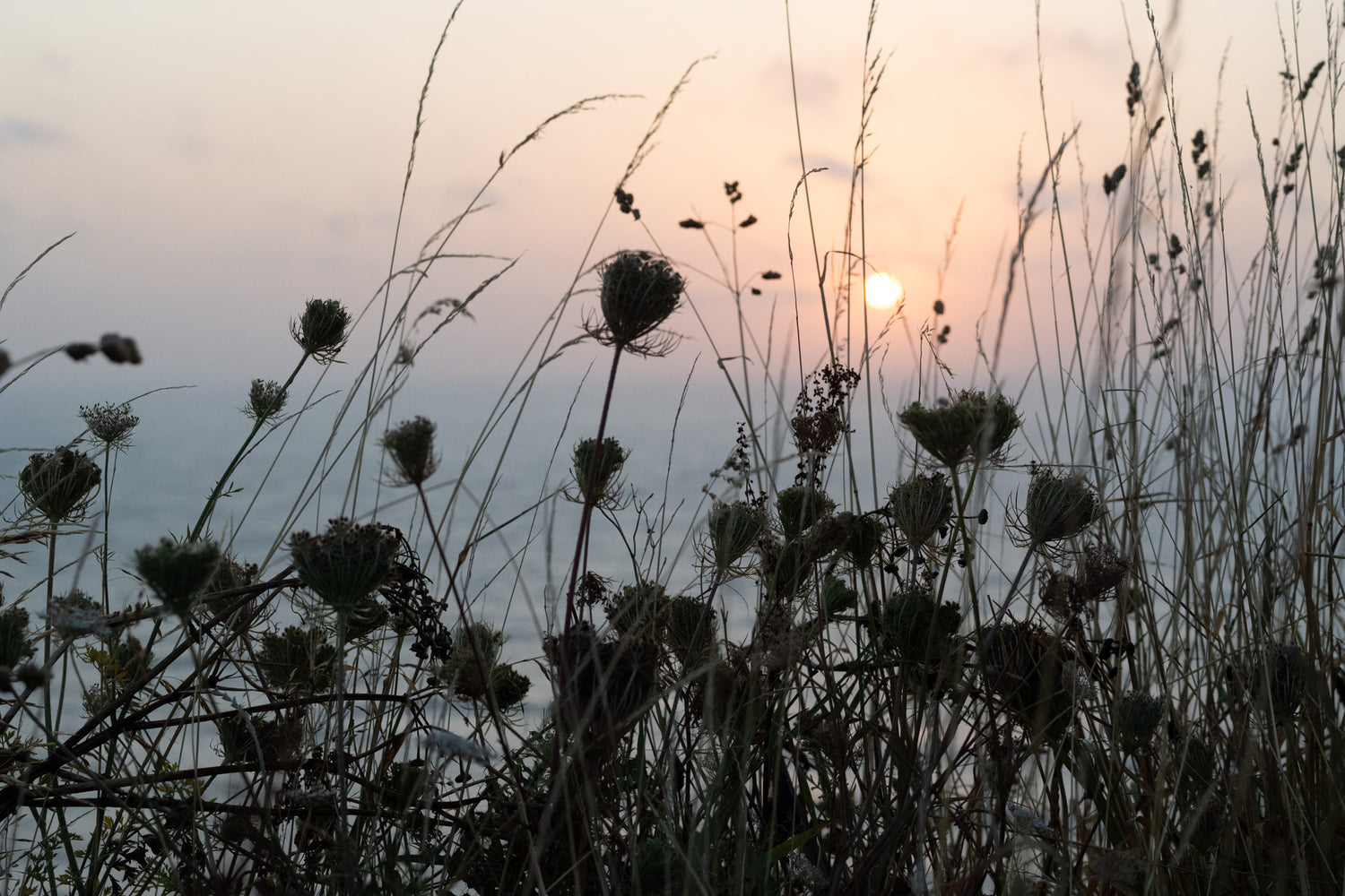
This is the colourway I was most nervous about finding. I wanted it to be a nod to the real colours of the fireweed and to the dull summer day sky that was above us on that day up at Popples Common when the idea struck, but not too purple and not too sky blue. After much tweaking we got there and I love it. It's called 'Full Bloom'. (Dean is good at naming colours too).


So by lunchtime we had the two colours I had come for. I thought it would take MUCH longer. I only really have a budget to print two, as it's a large outlay BUT we carried on playing, just in case and hoped I wouldn't fall in love with a thid colourway that I just HAD to find the money for!

After a couple of hours we found this.

If the other one is 'Wild Edge in Full Bloom', this one is 'Wild Edge in Shadow'!

As you can see, there are four colour chips here as we also printed a very light grey background (pad) to bring the white tones down a bit. The whites of the hogweed flowers are just the paper coming through you see.
And yes I've fallen in love with it and will have to find a way! 'Bit scary!

So there we are. Three new wallpapers and hopefully a little insight into the printing process. These three will be printed on the 5th October so I'll be back there again. The wallpaper will be available a little after that.
It was so great to be back at the factory again. I remembered how friendly and supportive it is. They print for huge wallpaper brands who create HUGE collections and I'm only a small company printing a design every so often, but they treat with with so much respect and kindness. I was most impressed by their company manifesto in the entrance lobby printed on a William Morris classic...

TO BRING THE BEAUTIFUL INTO PEOPLE'S HOMES & LIVES

'We're brave, we're bold. We take the lead and inspire others around us'.

'We take a creative and innovative approach to everything we do'.

'We consider customers, colleagues, the planet and the people who live on it'.
It's true! They do and it feels SO good to be working with them.
You can see all the Wild Edge colours and the rest of my wallpaper collection on my website here.


2 comments
I found this fascinating to read and look at. So pleased you had help and you all got there in a short time. It is such a lovely pattern, glad you had a 3rd thought as l think l love the Blue best 🙄 but l think they are all lovely, last night l was going back and forth looking at your other 2 patterns and colours. Your work is very beautiful. I think your studio is going to be wonderful and so well worth waiting for.
Your holiday in Scotland just made me so want to go there. It must have done yourself and friend the world of good and built up your strength, imagination and positiveness.
Im so looking forward to visiting your studio etc when it is possible, seeing your work close up, possibly meet yourself and others. This will be your turning point once you are in and open again wonderful.
😊🌟🤞🍀Wishing You All the Best
Angie
How interesting – thank you for sharing! The paper is beautiful.